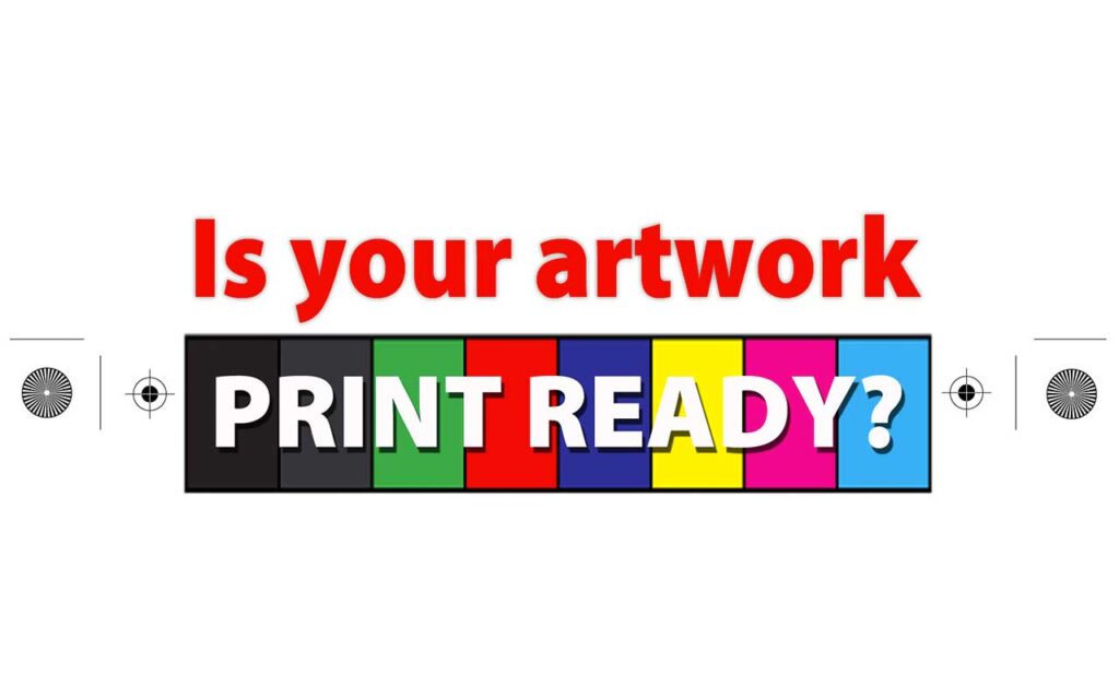
The Five Common Errors People Make With Their Artwork.
I’m not a mechanic, so I don’t attempt to service my car. The same goes for graphic design. If you don’t have the design skills, and the right equipment, then you should leave the designing to the professionals. In this Simply Print Blog, we talk about the five common artwork errors, and how to avoid them.
I’ve been in the printing industry for almost 40 years now, 19 as a business owner, so believe me, I’ve pretty much seen it all. Over the years I’ve seen some amazing designs, and I’ve also seen some downright shockers. You’ve probably seen them out there too. Business cards with overly large text. Brochures with dark text inside of dark blocks. Leaflets containing a thousand microscopic words telling you their life story from birth. Photos that are blurry or dull. The list goes on.
Let’s put all of the design flaws aside for now. There’s another part of the artwork that’s just as important as the design itself, and that’s ensuring it’s print-ready. I’d love to say that mistakes are only made by amateurs using Word, Excel or Punisher …….. I mean Publisher. But the truth is even professional graphic artists get it wrong sometimes. Not often, but occasionally. That’s OK, no one’s perfect. It’s really easy to miss something. Below are the five most common mistakes people make when supplying their artwork.
1. No bleed
Bleed is the image that extends past the trimmed edge. Bleed is required to ensure accurate trimming. When our clients supply their artwork at the exact size with the image right to the edge, we have to either trim it smaller or risk white showing on the edge. A tiny 2mm bleed makes all the difference and ensures you get a perfect edge. You know when you mow the lawn, and it’s the edging that makes it look professional? It’s the same with printing. Ugly edge = ugly job.
2. RGB Colours
It’s important that your artwork file is in CMYK format, not RGB. This ensures the colours are accurate. A common error is making all the text CMYK, but forgetting to do the same with the photos. The biggest mistake people make is selecting a really bright RGB colour, which makes it impossible to match. Always set the document to CMYK mode from the start.
3. Incorrect Size
Some people supply their business card files in the centre of an A4 document. Some supply them taking up the entire A4 document. And some people just take a stab in the dark and guess the business card size. Nothing looks worse than a business card reduced or enlarged out of proportion, so you need to supply your artwork at the correct size. Contact us if you want to know the correct dimensions of any job you’re working on. We’re happy to share.
4. Wrong file format
PDF is the best format to supply your files for printing. JPEG, PNG and GIF files are usually internet quality. And if we say your low resolution JPEG file is no good, converting it to PDF doesn’t make it any better. The file needs to be converted to PDF format from the high resolution Illustrator, InDesign or Photoshop file. If you don’t have any of these programs, refer back to our advice about not having the right equipment.
5. Incorrect brochure spacing
It’s OK that you might assume tri-folded A4 brochures are exactly one third of an A4 sheet when folded, and that’s how most people design their artwork. They just divide 297 mm by 3 and set the panels using 99 mm margins. This doesn’t work, because we need some space to allow the inside panel to tuck in. Some people will also mistakenly use American letter size instead of A4, as this is sometimes the default setting with Microsoft programs. This isn’t going to work in Australia. Check out our templates here which show the required spacing.
Programs to avoid
Programs with the words Microsoft in them are definitely the worst, followed closely by Corel Draw. Microsoft Publisher is regularly marketed as a graphic arts program, but it’s not even in the ballpark of Adobe Illustrator or InDesign. A Google search describes it as an entry level desktop publishing program, but even that’s being generous in my view. The problem with Publisher is that it lacks all of the “bells and whistles” that are standard with Adobe. It’s this lack of functionality that prevents you from creating print ready artwork. I can’t remember ever receiving artwork created in Publisher that didn’t require extra work from us to make it print ready. Canva is a lot better, but also has limitations because it’s still not a graphic arts program, regardless of how it’s marketed. So by all means, use these programs to supply the text and basic design, but save a lot of time and get a professional to design your job using the right equipment. Whether that’s us or another graphic artist, it doesn’t matter. The most important thing is your image and branding should represent you as a professional.